


Just a snippet of the fab work from Analogue, a full service graphic and digital design agency in the UK. I can’t get over all the great typography and colors in their work—see it all here.

Endless type inspiration at typeverything. I already tweeted about this earlier this week, but it’s worth posting here too.


found via pinterest


Lately I’m loving the posters by Moxy Creative, the newest highlights some of the most familiar men’s eyewear over the last 100 years. The compilation features 28 of the most iconic glasses from male personalities in music, entertainment and politics.
via pinterest and my modern met

New work for a special event at Café Atlántico celebrating the cuisine of the nation of Colombia from May 10-15. More details here if you’re interested in attending.
For freelance inquiries please email me at hello@sarahhanksltd.com
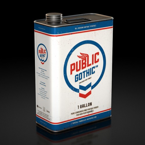
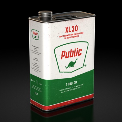
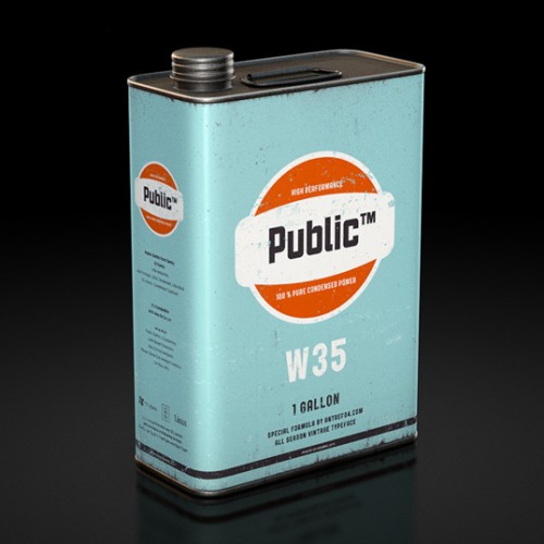
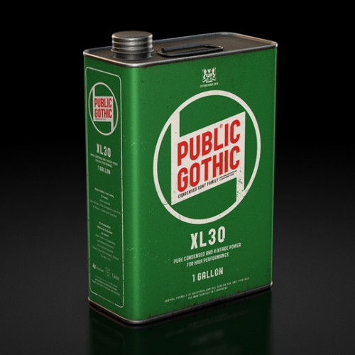
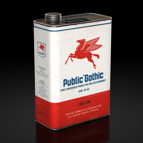
I’m not a freak about typography like many designers but I do get excited about great packaging. This morning while on Lovely Package I found myself duped by Antrepo. At first glance I thought I was admiring some gorgeous retro inspired oil cans. But, after closer inspection I discovered that I was in fact looking at a gorgeous sales pitch for their font Public Gothic. Maybe there is something to this typography thing after all.
– Christian


Another fun infographic poster from Pop Chart Lab. Remember their awesome beer and rap names ones too?
Available for purchase here.

In conjunction with Pyramid’s 30′s Birthday Open House celebration on April 9, Pyramid Atlantic Art Center will be selling sets of letterpress birthday cards designed and printed by various members of our PA letterpress community. That’s my design above! All proceeds from the sales will go to fund Pyramid’s awesome programs and facilities! You can find pictures and links to some of the other cards here.
I printed some extra and will add those to my shop this weekend!


Gorgeous design work for Pino. I especially love the logo wall in the store. “Pino is a market place for unique, functional and innovative design objects. The idea for the concept camefrom the name of the shop, Pino, which means a ‘pile’ or ‘stack’ in Finnish. That is taken visually into the new logo and the design of the shop fixtures. The interior concept with a subtle colour palette works as a background for the fresh, colourful identity and products.”
via behance


