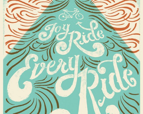
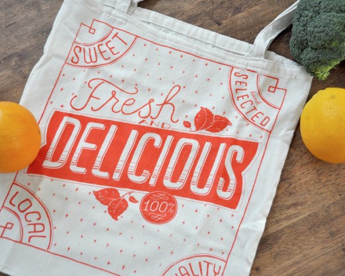
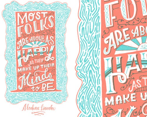
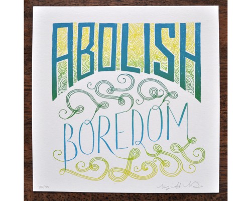
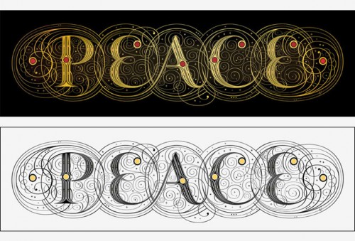
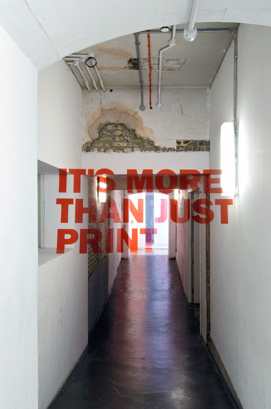
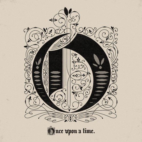
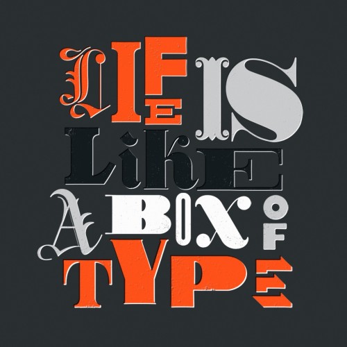
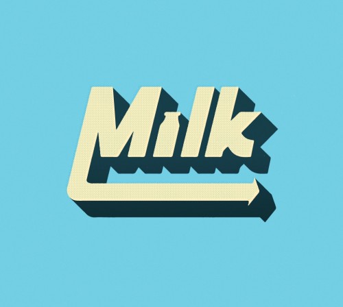
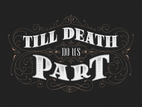
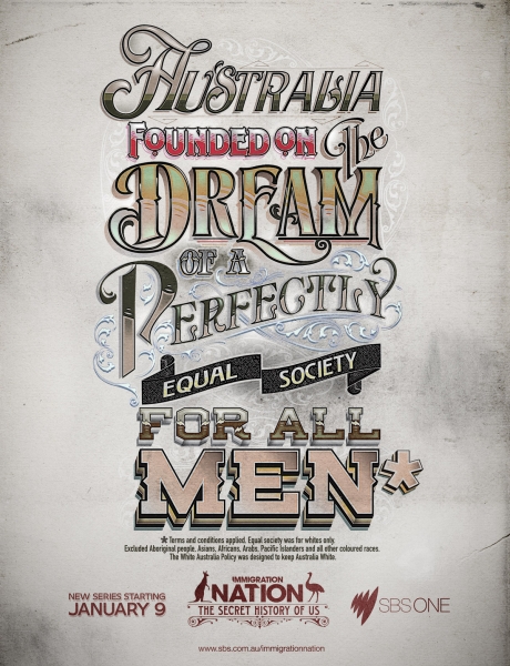
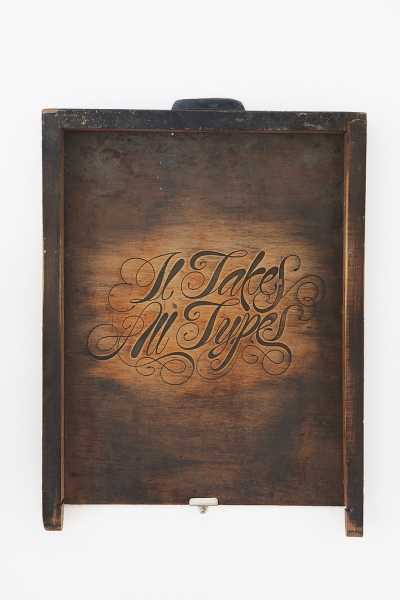
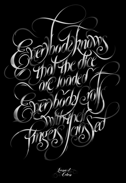
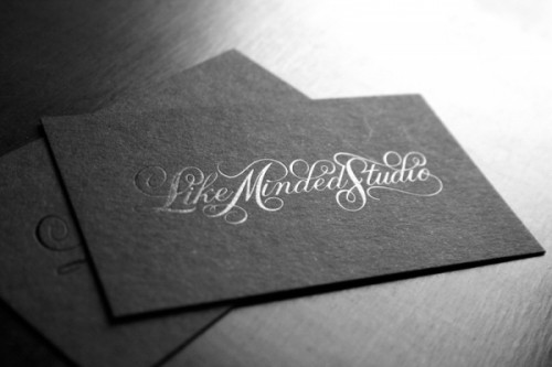
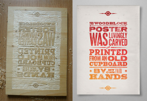
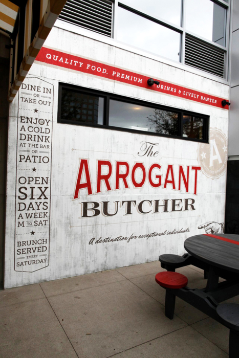
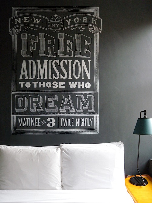
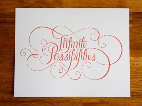
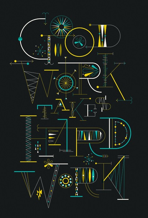
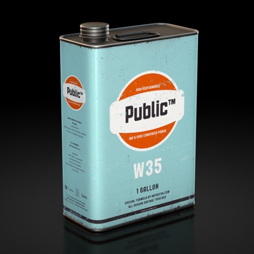
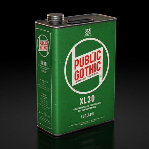
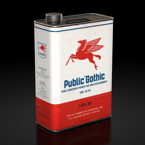
Beautiful hand lettering from Mary Kate McDevitt.
Posts Tagged ‘typography’
type tuesday: mary kate mcdevitt
Tuesday, November 22nd, 2011type tuesday: seb lester
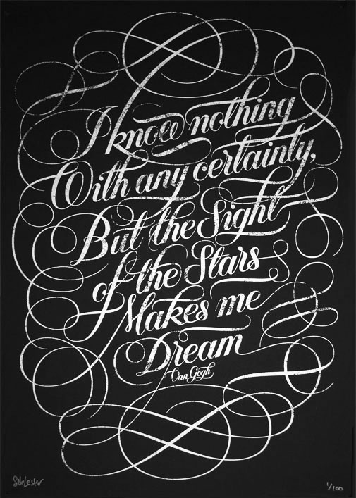
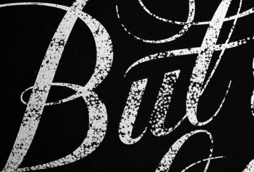
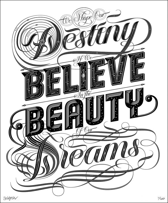
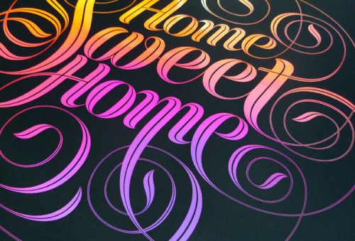
Tuesday, September 27th, 2011I’ve been a long time fan of Seb Lester‘s gorgeous lettering. Here are a few of my favorites from him. I especially love the Van Gogh stars print; how genius is he to make the lettering out of stars! And of course I adore the Home Sweet Home print (since I have one and it’s hanging in my bedroom.) View all of his work here.
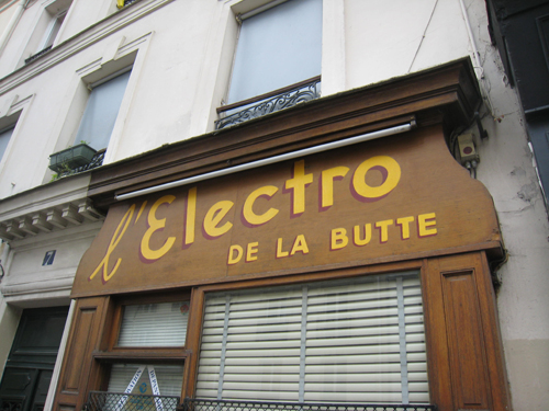
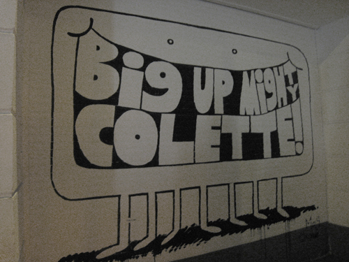
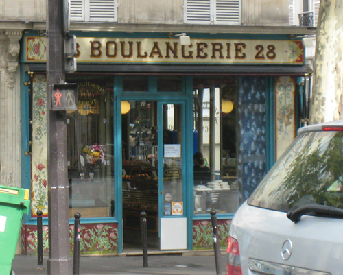
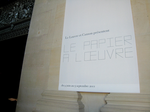
type tuesday: seen in paris
Tuesday, August 23rd, 2011type tuesday: jon contino hand lettering
Tuesday, July 26th, 2011type tuesday: anamorphic typography
Tuesday, July 19th, 2011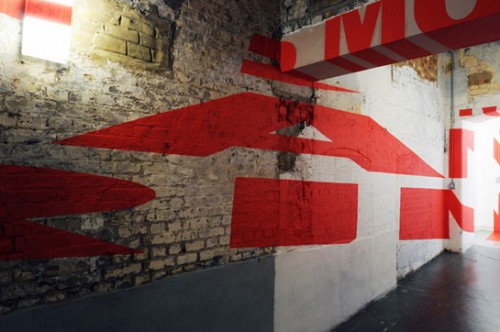
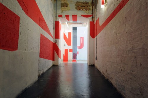

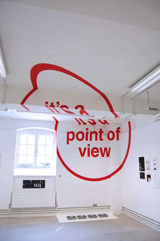
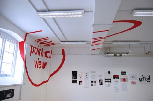
An exploration of the potential and existing relationship between architecture and typography by Joseph Egan at the Chelsea College of Art & Design in London.
“Our work encourages the viewer to walk into and around typography, an immersive experience considering that their usual relationship with type would normally be realised on a two dimensional surface be it printed or computerised. Being able to appreciate it physically painted onto walls of buildings which the viewers are used to interacting with every day draws attention to the beauty of typography and at same time highlighting the architectural forms that it adorns.”
via Alison Owen blog
the phraseology project
Friday, July 8th, 2011Seems like all my recent blog finds are typography related, but i can’t help it, there’s some pretty awesome type work being done right now! This post is about The Phraseology Project, a site that lets you submit a letter, word or phrase and they’ll make it look beautiful with type.
like minded studio
Wednesday, July 6th, 2011typeverything
Thursday, June 30th, 2011Endless type inspiration at typeverything. I already tweeted about this earlier this week, but it’s worth posting here too.
found via pinterest
Public Gothic and How to Sell a Font
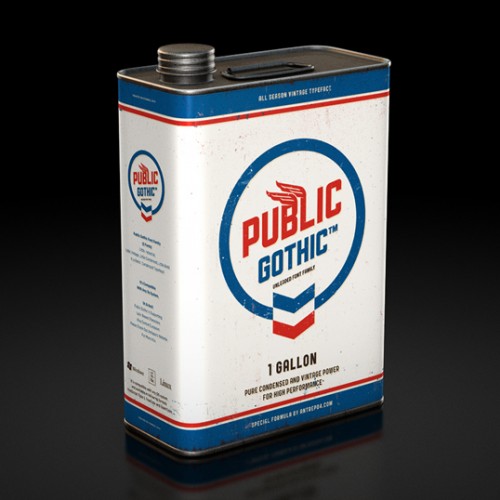
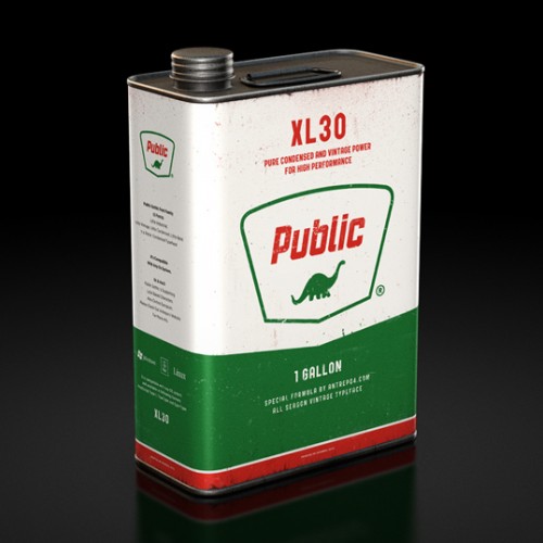
Wednesday, April 27th, 2011I’m not a freak about typography like many designers but I do get excited about great packaging. This morning while on Lovely Package I found myself duped by Antrepo. At first glance I thought I was admiring some gorgeous retro inspired oil cans. But, after closer inspection I discovered that I was in fact looking at a gorgeous sales pitch for their font Public Gothic. Maybe there is something to this typography thing after all.
– Christian
